


Power BI Custom Visuals
Power BI provides a broad set of out-of-the-box visualizations and a large set of Custom Visuals.
But if these sets are not sufficient to provide the needed insight? DataScenarios can help you by using your design to create a custom visual that helps your company to gain more insights.
As reference: Jan Pieter Posthuma has a couple of custom visuals published:
HierarchySlicer
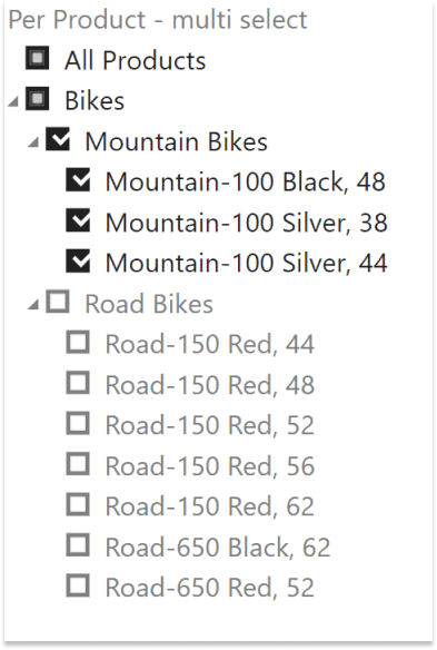
The hierarchy slicer for Power BI provides a straightforward way to combine multiple members of various levels together as a hierarchy and use it as a selection. The slicer can be used with an existing hierarchy, or a manual created hierarchy.
The visual can be found at: https://appsource.microsoft.com/en-us/product/power-bi-visuals/WA104380820?tab=Overview?ocid=HierarchySlicer-cv-page-en
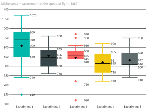
Box and Whisker chart
A box and whisker chart shows basic statistical information (five-number summary) of a dataset: the 1st and 3rd quartile (box), the median (line), the mean (dot) and dependent of the type: the minimum and maximum value, or the 1.5x interquartile range [IQR]; hence the whiskers.
Questions
If you are interested or want to know more, feel free to contact us.